Focus comes equipped with everything you need to produce a professional-grade website. You’ll be amazed by how easy it is to look incredible with the world’s fastest WordPress Theme.
Discover all the text formatting styles you’ll have at your disposal by browsing the demo article below.
Sub-Headings (Heading 2)
To create a sub-heading, all you have to do is wrap your heading text in <h2>, <h3>, or <h4> tags, and BOOM, you’ll get results like you see here. (The one above is an <h2>.)
Want an easier approach? Using the visual editor, simply select Heading 2 to deploy a Focus sub-heading.
Note: Heading 1 is reserved for your page title and should not be used inside your content!
Second Level Sub-heading (Heading 3)
Sometimes you need section breaks within sections, and that’s where these second level sub-headings shine! Use the visual editor to turn basic text into a Heading 3, and you’ll increase the clarity of your pages.
Hyperlocal sub-heading (Heading 4)
- Introducing a list, pricing table, command, etc?
- Sometimes a Heading 4 (
<h4>) is just what you need - Try it out, and see if it makes sense!
But that’s not all! Sometimes, sub-headings aren’t quite right for the job, but you may still want some large text that will make a big impact on readers…
For example, I need you to read this! So I’m gonna make the text bigger, and I’m also gonna have it extend beyond the boundaries of the basic column of text. Now that’s impact, baby!
Visually, impact text works even better when it’s surrounded by basic paragraphs—it’s a vertical symmetry thing. Cool, eh?
Lists
Lists are easy for readers to digest, and because of that, most people love ’em. With that in mind, you oughta start using more lists in your posts!
The image above should be wrapped in <p> tags until Focus 1.5.1 or higher.
Focus includes three killer list styles1, and your job is simply to choose the one that is best-suited to your particular needs2. The first type of list is an unordered list, and it looks like this:
- List item 1
- List item 2 with a link
- List item 3
- Nested list item 1
- Nested list item 2
- List item 4
The second type of list is an ordered list, and it looks like this:
- List item 1
- List item 2
- List item 3
- List item 4
 The third and final type of list is called a definition list. Although they are less common, they can be useful for presenting definitions, relationships, or simply for clarification. Check it out:
Just kidding—we’re not going to test those because normal humans aren’t going to use them. In reality, Focus only comes with two basic list styles (ordered and unordered).
Full-width Bleeds
Because they’re so flexible, bleeds are suitable for any type of presentation you can imagine. For example…
Whenever designers introduce full-width section breaks (which bleeds are), they often want to display things side-by-side to cover the usable horizontal width of the layout.
Basic bleed content is just like article content—constrained to the width of the content column. But by adding the full attribute to your bleeds, you can force the content inside them to cover the entire usable width of your layout (equal to $w-total).
Blockquotes
Here’s a caption after an h2, but also inside a bleed. Let’s check that spacing…
This is one area where my themes have no peers…
Every theme worth its weight in bandwidth comes with some sort of pre-defined blockquote styling, but how many themes do you know of that come with three different blockquote styles? This is one area where my themes have no peers, and you can use these blockquote styles to your advantage as you liven up your posts for your readers.
This is a breakout, and it packs a serious visual punch. Because it “breaks out” of the middle of your content and then touches the right side of the screen, this breakout is unmissable!
It contains some small text, maybe for a disclaimer.
The quote above is what is referred to as a “pullquote,” and you can create two types of these in your posts—one will be aligned to the right, and the other to the left. Use the following structure to make it happen: <blockquote class="x">, where x is replaced by either “left” or “right,” depending on which side of the text you want your pullquote to display.
Standard Blockquote
And this caption follows an h3 sub-heading. Does it look right?
This is a pullout—it touches the right edge of the screen but doesn’t interfere with the main content column.
And naturally, no theme would be complete without the standard old blockquote, which comes out looking like this:
Lorem ipsum dolor sit amet, consectetuer adipiscing elit. Quisque pharetra velit vel purus. Nunc tempor, urna sit amet euismod elementum, erat tellus auctor erat, non condimentum dui wisi non orci. Nam fringilla leo sed dui. Vestibulum ac elit sit amet diam vehicula scelerisque.
~ Some Latin guy
To use these, simply wrap your quoted text in <blockquote> tags.
Alerts, Notes, and Content Boxes
What about a caption after an h2 after a bleed?
Every great Skin should come with savvy alert and note classes for maximum content pwnage.
Here’s some basic small text.
Sometimes, you may even want to include more than one paragraph, so the really cool Skins will be sure to account for both.
Once again, we explore the styles included with this Skin and find that we have a versatile note class.
And what about this small text?
Perhaps you’ll be able to get away with whatever markup you like in here…or perhaps you won’t.
One thing is for sure—these notes won’t go unnoticed.
But we’re not restricted to these basic callouts when we want to grab people’s attention. Try adding some pop or some impact text (or both!) when you want to make a big impression:
This impact text really stands out—especially when it spans the entire usable width of the layout.
And it makes this alert just a little more irresistible.
Can a Heading 2 appear first inside a callout?
Well look at that—Focus includes specific styles to accommodate this useful scenario.
This is a callout with a Heading 3
How does the spacing work out? How is Focus so smart? How does he do it, folks?!?
Can we put small text in here?
If you want to get totally freaky, you could try a breakout with some impact text. Think about it!
Input Styles
Most Themes skimp on input styles, but with Focus, you get the full suite
And then what do we do about this?
Buttons
Content Extensions
 This is a basic content extension. It mainly exists for testing purposes; namely, to see how basic extensions and breakout behavior work in different Content Presentation Modes.
Of course, we can’t really test without a few paragraphs, so some of this text is going to drag on in a boring manner.
Will I make it out to disc golf today? Rhetorical. I’m testing software updates right now, but only for the next 45 minutes or so. After that, it’s off to the course!
What happens after that? Probably the usual—a run to Briscuits and then to the coffee shop to pick up a cortado. Do afternoons exist without caffeine? We’re not going to find out.
Image Styles
Images are attractive! Use these styles to maximize the attention they receive
We’ll start with a left-aligned image followed by a simple caption:
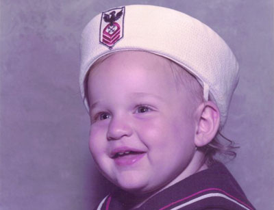
Left-aligned with a caption
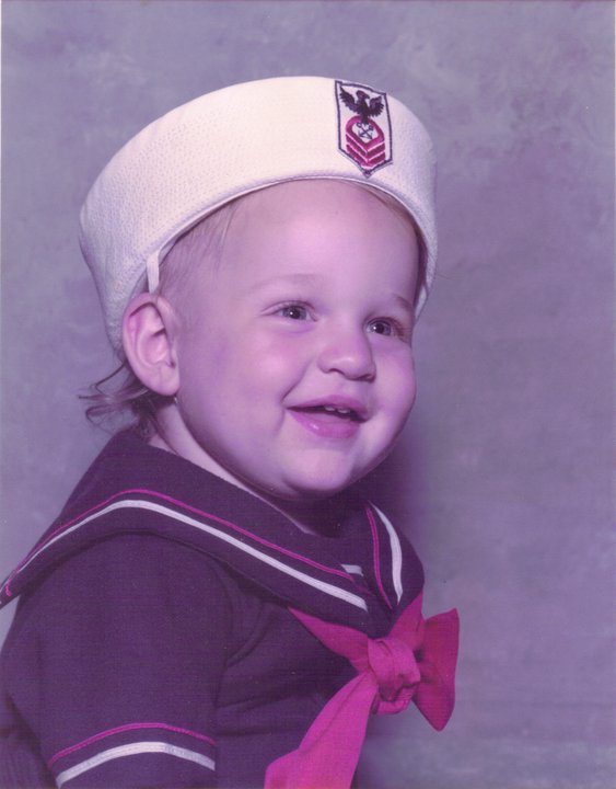
Looks great! But what if we have a centered image followed by a caption?
Focus will detect the centered image and center your caption, too!
How about an extended image test? Here’s one with no frame:
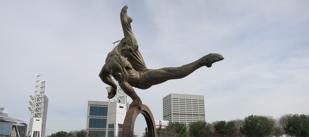
How far can we extend this caption text? Can we add some contextual CSS to pwn it in various settings? Let’s have a look…
And here’s one with a frame:
What happens if you put a caption after a framed image?
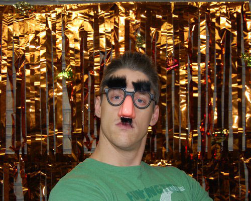
Next, we have a captioned WP post image:
Epic toe pointing is epic. Are links epic, too?
Next, a smaller captioned WP post image:
F’n caption, duuuude!
Image Extension Test Area
Here, the image itself is extended.
But here, the image and caption live inside an extension.
That’s it—just keep typing, and pretty soon, we’ll have enough stuff to make this a reliable test page.
Let’s add some content.
I’m going to combine some of this stuff, and we’ll see if these Editor controls work.
Keyboard Styles
Does your Theme support styles for the <kbd> element? If so, they’ll appear below.
Thesis CSS Editor shortcuts:
Save CSS
- Mac: command + s
- Win: ctrl + s
Find
- Mac: command + f
- Win: ctrl + f
Replace
- Mac: command + option + f
- Win: ctrl + shift + f
Find next
- Mac: command + g
- Win: ctrl + g
Find previous
- Mac: command + shift + g
- Win: ctrl + shift + g
1 This is the first footnote.
2 How about a second footnote? This explains a lot, doesn’t it? Now, how do you get back to the main text once you’ve arrived at this footnote?
3 This is the third and final footnote. Where’s your styling now, mister?